Animators working beside a window
If you arrange frames in changing daylight, you’ll want to make sure you can still see outlines and controls despite possible reflections.


For animation beside a bright window, an anti-glare 4K monitor is a good choice only if you also consider its position and the direction of the light. The German Social Accident Insurance recommends sitting with your line of sight parallel to the window. Choose 27 inches if desk space is limited, or a larger model if you want to arrange frames and tools at a physically larger size – the same 4K resolution does not give you more pixels. For colour-critical approval, what matters is choosing the right project colour space and following a calibration process, not just the screen coating or brightness rating.
If you arrange frames in changing daylight, you’ll want to make sure you can still see outlines and controls despite possible reflections.
If you need to see several images and tools at once, you’ll have to balance extra workspace against the room available on your desk.
If you need to judge project colours accurately, it’s important to have suitable colour modes and a calibration workflow that fits your process.
The German Social Accident Insurance recommends positioning your screen so that you look parallel to the window. Then assess the workspace, colour workflow and connections for your particular setup.
| Consideration | What to check when buying | Who is it most relevant to? |
|---|---|---|
| Visibility in light from a window | Anti-glare surface and the model’s typical brightness; consider peak HDR brightness separately. | If I edit frames beside a bright window, I want to keep reflections and distracting light under control as much as possible. That’s why around 36% of consumers put glare protection and readability first. |
| Space for frames and tools | Try out your layout at the scaling you want; compare the monitor’s width and stand with the space available on your desk. | If I want to see several frames and tools side by side, I need a physical screen size that suits my desk. Around 29% of consumers prioritise a clear, well-organised workspace. |
| Colour for previews and approval | Check the project colour space against the documented colour modes; if you regularly approve colour, consider your calibration requirements. | If project colours need to be accurate for approval, I want to use the right output colour space and check the display in a reliable, repeatable way. Around 21% of consumers put colour approval and, where necessary, calibration first. |
| Connections and positioning | Check your computer’s video output and charging requirements against the monitor’s connections and Power Delivery rating; check its adjustment options. | If my computer needs to connect in a particular way and the screen has to sit in the right position by the window, I make sure both suit my workspace. Around 14% of consumers prioritise connections and positioning. |
The BenQ PD2706U has a typical brightness of 350 nits and a peak HDR brightness of 400 nits. These are different figures, and neither on its own tells you how easy the screen will be to see at your window-side workspace.
Compare typical brightness and screen coating separately, and check how the screen’s position affects reflections.
The 27- and 31.5-inch models considered here each have 3840 × 2160 pixels. The larger screen gives you more physical display space, but no extra native pixels.
Try your frame layout at the scaling you want, and measure the available desk space and stand.
A documented colour space or mode alone does not tell you whether the display suits your project’s output target or is checked regularly.
Set your project colour space first, then decide whether additional calibration features suit your workflow.
DesignVue models for compact 27-inch workspaces or a larger 31.5-inch screen.
The ProArt PA279CRV is a 27-inch 4K option with documented colour modes, an anti-glare surface and USB-C.
The ColorEdge CG2700X is designed for colour-critical graphics and post-production workflows, with 4K resolution on a 27-inch screen.
The UltraSharp U2725QE combines a 27-inch 4K format with a Thunderbolt workstation setup.
The UltraFine 27UP850K-W is a 27-inch option with an IPS panel, USB-C and an adjustable stand.
The Joybuy products below are 4K monitors for frame layouts. Depending on the model, the focus is on an anti-glare surface, a larger display or details of colour and connectivity features.
 No image available
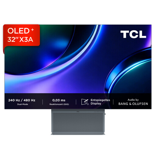
The 32-inch screen is an option if you want to arrange frames across a larger physical display area.
Specifications listed in the product name: 3840 × 2160 pixels, OLED+, 240 Hz or 480 Hz at FHD, 1,300 nits, 0.03 ms GtG and an anti-glare display. The brightness figure alone does not tell you how easy the monitor will be to see beside your window.
 No image available
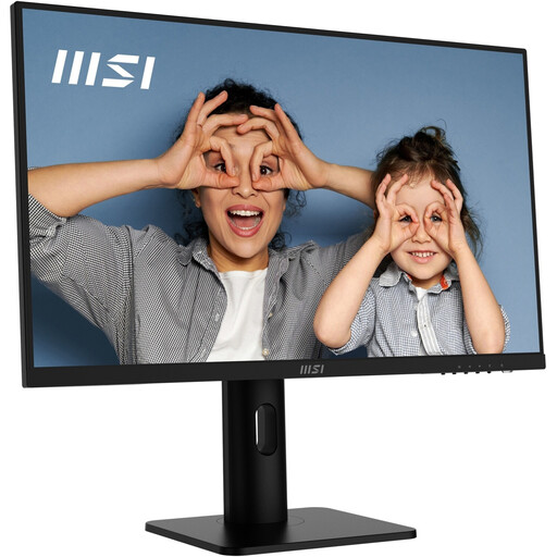
The 27-inch format could suit a more compact workspace where you still want to arrange frames in detail.
The product name lists 4K UHD, IPS, 60 Hz and HDR Ready; the product description mentions a matte surface and height, swivel, tilt and pivot adjustment. According to the description, the monitor should not be exposed to direct sunlight for extended periods.
 No image available
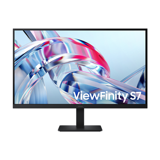
The 27-inch format is a more compact option for 4K frame layouts.
The product specifications list 3840 × 2160 pixels, IPS, HDR10 and 99% sRGB colour gamut coverage.
 No image available
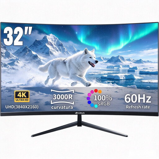
The 32-inch size could work well for larger frame layouts; check that you have enough desk space before buying.
Specifications listed in the product name: curved VA display with 3000R, 3840 × 2160 pixels, HDR10 and 100% sRGB.
 No image available
An anti-glare surface and adjustable positioning are worth considering when choosing a monitor for a bright workspace.
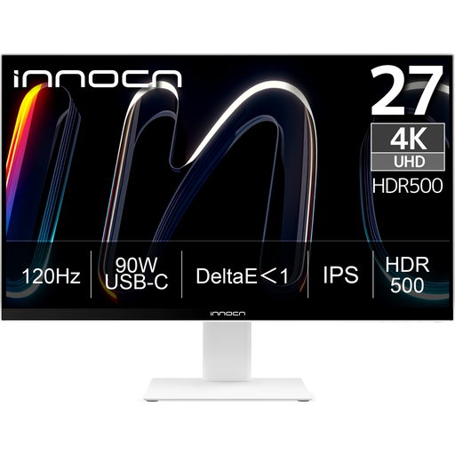
The product specifications list 3840 × 2160 pixels, IPS, 120 Hz, HDR500, NON-GLARE, USB-C with 90 W Power Delivery and height adjustment. The description also lists DeltaE < 1 and 100% sRGB.
No. A brightness figure alone does not prove that the screen will be easy to see at your window-side workspace. Check your viewing angle and any distracting reflections, and consider whether you can adjust the screen or window coverings. When comparing brightness, don’t confuse typical brightness with a peak HDR figure.
The German Social Accident Insurance recommends sitting with your line of sight parallel to the window when working at a screen, to avoid distracting glare. Try the position with your actual frame layout and in the light conditions you get at different times of day.
Set the monitor mode to match the project’s intended output colour space, rather than automatically choosing the mode with the widest gamut. If you regularly approve colour, also check whether your workflow includes calibration and how you’ll verify the display.
Check your computer’s video output and charging requirements against the connections and Power Delivery rating of the specific monitor. A USB-C specification alone does not confirm that the connection you want will work with every computer.
For workplaces covered by workplace regulations, the annex to the Workplace Ordinance requires distracting glare, reflections and reflections in the screen to be avoided. This does not mean that private buyers have a general legal obligation to buy a particular product, or that there is a single minimum brightness. The German Environment Agency advises against putting electrical appliances in household rubbish; they should be returned separately for recycling.