Layout and text designers
If you work on venue descriptions, navigation and previews side by side, extra screen space can be useful. Also check that text and controls remain easy to read at your preferred scaling.


Choose a monitor based on your main task: QHD may be enough for text and layout work, while 4K gives you more pixels for using windows side by side and viewing image details, as long as everything remains easy to read at your chosen scaling. For longer sessions, adjustability matters. If you’re connecting a laptop, make sure the video output and charging power are suitable for your computer. A large monitor is no substitute for testing at narrow browser widths and with magnification, or for a thorough accessibility review. The W3C says that no single testing tool is enough for a complete assessment.
If you work on venue descriptions, navigation and previews side by side, extra screen space can be useful. Also check that text and controls remain easy to read at your preferred scaling.
Documented colour modes are worth considering when working with photos and visual wayfinding aids. However, manufacturers’ colour-space specifications don’t prove that your finished guide has sufficient contrast or is accessible.
If you regularly connect a laptop or share a screen with others, suitable ports and adjustability are important. Make sure the video and charging features work with your computer and setup.
First decide what matters most to you: screen space for side-by-side views, image work, a suitable screen position or connecting your laptop. The percentages below refer to consumers choosing a monitor for layout, image work and responsive testing on a venue guide.
| Priority | What to check before buying | Who particularly values it? |
|---|---|---|
| Layout space and narrow views | Check the resolution and screen size against your chosen scaling; test the guide separately in narrow and magnified browser views. | When I work on layout and text at the same time, I need room without losing sight of narrow views. Around 33% of consumers put layout space and reflow first. |
| Image detail and colour reproduction | Check the documented sRGB mode for the specific model; assess web contrast and usability separately. | For photos and graphics, I want to assess colour reproduction using verifiable specifications and check contrast separately. Around 27% of consumers prioritise image and colour work. |
| Ergonomics | Consider height and tilt adjustment, as well as the stand’s footprint or VESA mounting. | When I spend long periods working on the guide or change my sitting position, I want to be able to adjust the screen to suit my workspace. Around 20% of consumers say ergonomics is their top priority. |
| Laptop connectivity | Check the video output, hub features and your laptop’s charging needs against the specified ports and Power Delivery output. | When switching between my laptop and workspace, I want to connect the display and the peripherals I need. Around 20% of consumers put laptop connectivity and docking features first. |
The W3C’s guidance on reflow relates to the width of the CSS viewport, not the pixel count of your desktop monitor.
Also test the guide in a narrow browser viewport and with magnification, including maps and tables.
Browser, zoom and usability testing take extra time.
A manufacturer’s specifications describe a monitor model, not the accessibility of the content you create with it.
Use a documented colour mode as a starting point, then check the guide’s contrast and usability separately.
Video output, charging power and KVM features vary by model, and must also work with the computer you connect.
Compare your laptop’s video output and charging needs with the ports and features of the specific monitor.
If it doesn’t support the connection you need, you may require an extra dock or power adapter.
The ProArt PA279CRV is a 27-inch 4K option for layout and image work.
The DesignVue PD2705U is a 27-inch 4K option with a documented focus on sRGB.
The UltraSharp U2725QE is a 27-inch 4K option with a Thunderbolt hub.
The FlexScan EV2795 is a QHD office option for text work and shared workspaces.
The UltraFine 27UP850K-W is a 27-inch 4K option with USB-C.
The Joybuy products below include 27-inch QHD and 4K models for text, layout and image work; some also offer features for connecting a laptop.
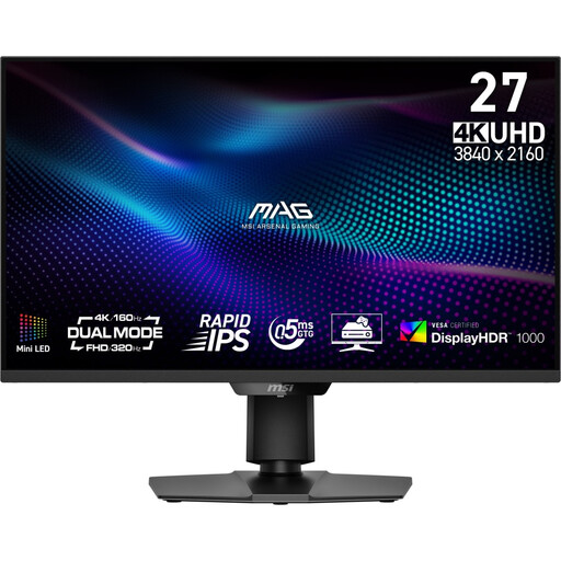 No image available
For 4K layout and image work, if you want to use the different specified display modes.
27 inches; 3840 × 2160 pixels; Mini-LED; height-adjustable stand with pivot, swivel and tilt. The stated colour-space coverage is 100% Adobe RGB and 98% DCI-P3; this doesn’t prove that the finished guide has sufficient contrast.
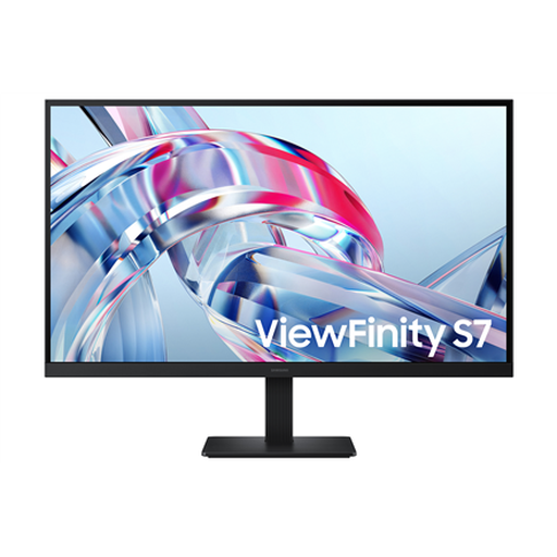 No image available
A 4K option for detailed layout and image work, if tilt adjustment is enough for your workspace.
27 inches; 3840 × 2160 pixels; IPS; HDMI and DisplayPort; tilt adjustment and VESA mounting compatibility. The product’s 99% sRGB specification doesn’t prove that your website has sufficient contrast.
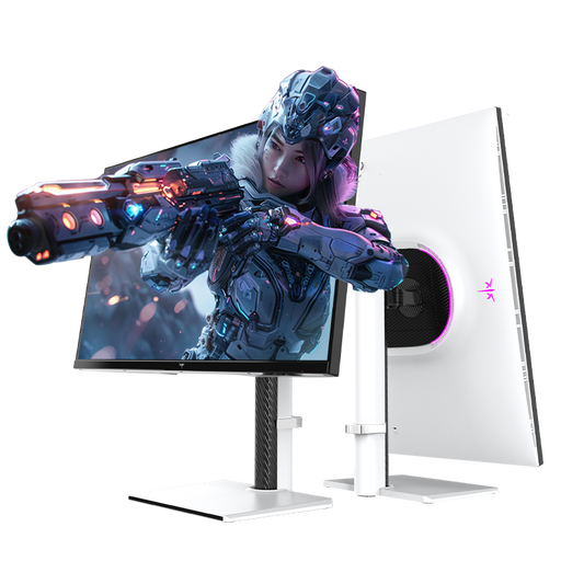 No image available
For detailed 4K work and laptop connectivity, if the specified ports are compatible with your computer.
27 inches; UHD with 3840 × 2160 pixels; 65 W USB-C; KVM switch; height-adjustable stand with swivel and tilt.
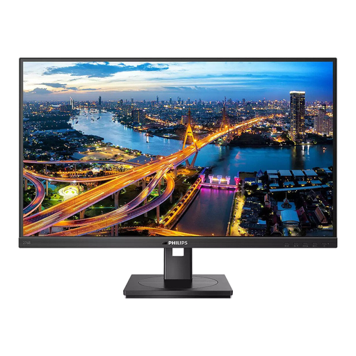 No image available
A QHD option for text and layout work, if you also want USB-C docking and an adjustable screen position.
2560 × 1440 pixels; USB-C docking with up to 90 W Power Delivery; Ethernet; height-adjustable stand with tilt, swivel and pivot.
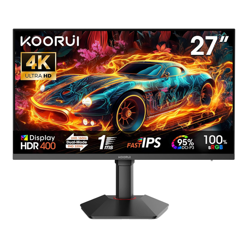 No image available
For 4K layout and image work, if the adjustment options suit your workspace.
3840 × 2160 pixels; 160 Hz in 4K and 320 Hz in FHD; Fast IPS panel; height-adjustable stand with tilt and pivot. The product specifications list 100% sRGB and 95% DCI-P3; these figures don’t tell you the contrast of your guide.
No. Also test the guide in narrow browser views and with magnification. The W3C’s guidance on reflow specifies a width equivalent to 320 CSS pixels for vertically scrolling content and describes exceptions, such as maps and certain data tables. This CSS measurement isn’t a monitor specification. The W3C also says that no single testing tool is enough for a complete assessment.
Adjust the screen position and magnification to suit your workspace and eyesight. The Federal Institute for Occupational Safety and Health (BAuA) explains how screen position, individual vision and, where necessary, glasses can be adjusted to work together. An adjustable monitor makes it easier to find the right setup.
Compare the specific model’s EU energy label and energy consumption information rather than assuming that screen size alone determines running costs. For qualifying faults in consumer purchases within the EU, the statutory minimum guarantee is two years; this is separate from any additional manufacturer’s guarantee. The European Union explains these rights.
You can’t determine that from the choice of monitor or the word ‘guide’ alone. The Federal Agency for Accessibility outlines BFSG obligations for certain services, including e-commerce provided in response to an individual consumer request in connection with a consumer contract. It explains the BGG and BITV 2.0 separately for websites run by public bodies. Check who operates the published guide and how it is offered before deciding whether a specific obligation applies.