Photo editors working by a window
If you compare edits in changing daylight, you should consider both reflections and the amount of light entering your workspace.


Start by setting up your workspace to minimise reflections from windows and sunlight on your screen. The German Social Accident Insurance recommends positioning your line of sight parallel to the window; an anti-glare surface alone will not eliminate direct glare. Then choose a colour mode and calibration options to suit your output: sRGB is relevant for web images, while print preparation requires a suitable colour space and a profiled workflow.
If you compare edits in changing daylight, you should consider both reflections and the amount of light entering your workspace.
For print preparation, what matters is a colour workflow suited to your output profile and the right colour gamut coverage – not simply vivid-looking colours on screen.
If you mainly edit images for screens, check for an sRGB mode and choose connections and a setup that suit your laptop and workspace.
First decide how you’ll manage light and reflections by the window. Then you can match the colour mode, calibration and connections to your intended output.
| Consideration | What to check when buying | Who it matters most to |
|---|---|---|
| Reflections and light from windows | Check the screen surface, your viewing direction and whether you can adjust the window shading in your workspace. | When I compare edits in changing daylight, I want to minimise distracting reflections. Around 36% of consumers put reflection control first. |
| Colour matching for print | Check the colour space you need, the calibration method and whether ICC profiles are supported. | For print preparation, I need a repeatable comparison that matches my output profile. Around 29% of consumers prioritise assessing colour for print. |
| Colour mode for web images | Check for a clearly specified sRGB mode and how your editing software handles colour profiles. | If my images are mainly viewed on screens, I want to assess them using a suitable sRGB workflow. Around 21% of consumers focus on colour control for web images. |
| Connections and setup | Compare the video connection, laptop charging requirements, stand adjustments and VESA mounting options. | For my desk, I want my monitor, laptop and available space to work well together. Around 14% of consumers give connections and setup top priority. |
A coating can reduce reflections, but it won’t tell you how direct sunlight will affect your workspace.
First, plan where to position your screen and check whether you can control the incoming light.
Depending on your workspace, you may need to move things around or add adjustable window shading.
A stated colour space alone does not guarantee an accurate match to the intended print result.
Check the colour mode, calibration method and profiles used in your print workflow.
A profiled colour workflow takes time; depending on your setup, you may also need calibration equipment.
The glass, stand and connections can vary between specific versions.
Before buying, check the full model name, screen surface, video output and charging requirements individually.
Depending on the version you choose, you may need extra cables or a compatible mount.
The ProArt range is relevant to this comparison, including the PA279CRV model.
BenQ has different ranges to suit photo and design workflows, depending on the model.
The ColorEdge range is designed for repeatable colour workflows. For the CS2740, EIZO lists features for print preparation that are specific to the model.
The Studio Display may suit compatible Mac setups where P3 or sRGB projects are the main focus.
The UltraSharp U2725QE is a 27-inch 4K option focused on connectivity and workspace features.
The selection ranges from models with a specifically stated anti-glare or matte surface to options with a specified sRGB mode. For print preparation, check the colour space and calibration details for each version separately.
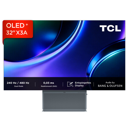 No image available
Could be worth considering for detailed photo editing if you’re looking for a 4K UHD OLED display with a specifically stated anti-glare surface.
The product details specify 4K UHD, 3840 × 2160 and OLED; these specifications alone do not show that it is suitable for a particular print workflow.
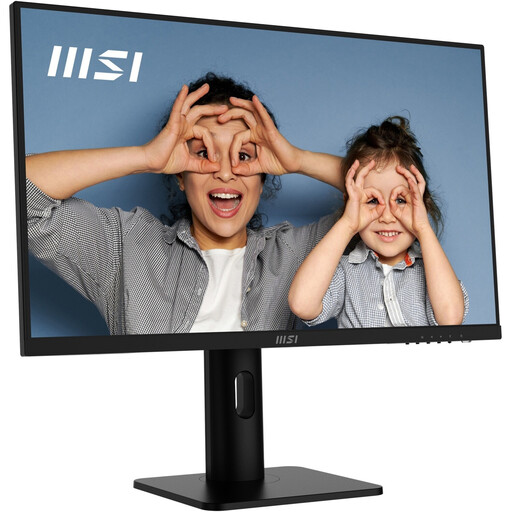 No image available
Could be a good fit for web images in an sRGB-focused workflow if you’re looking for a specifically stated sRGB mode and a matte surface.
The product details list a 4K IPS panel, 10-bit colour depth and a height-adjustable, swivel and tilt stand.
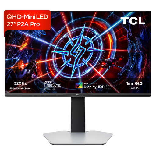 No image available
Could be an option if you’re considering a QHD monitor with a stated wide colour gamut; check the colour mode details against the needs of your intended output.
The product description lists QHD resolution and an HFS IPS panel.
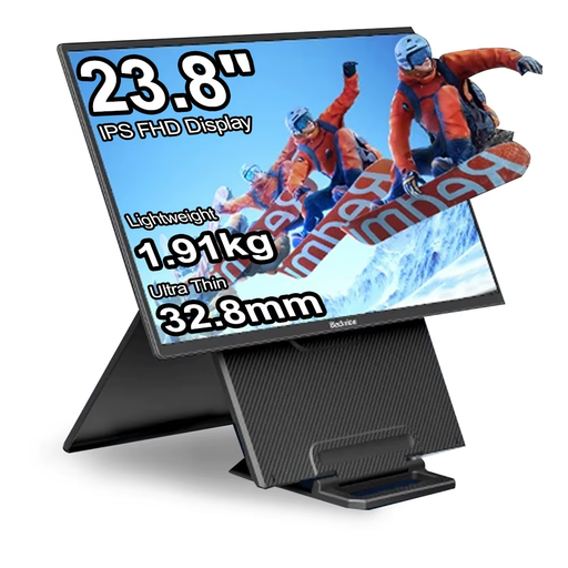 No image available
Could suit an sRGB-focused workflow across different devices if you’re looking for a portable monitor.
The product details specify 100% sRGB, USB-C and Mini HDMI connections; check that they’re compatible with your device.
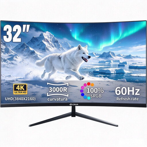 No image available
Could be worth considering for sRGB-focused web images if you’re looking for a curved 4K monitor with specifically stated sRGB coverage.
The product name specifies 3000R, a VA display, HDR10 and 100% sRGB.
No, not on its own. The German Social Accident Insurance recommends positioning your line of sight parallel to the window. An anti-glare surface can help, but it does not replace controlling the light in your own workspace.
Choose a colour mode to suit your intended output and use a matching profiled colour workflow. Also check which calibration method the specific model supports, and keep an eye on lighting conditions in your workspace when daylight changes.
Not necessarily: an available sRGB mode matters for an sRGB-focused workflow. Colour profiles determine how colours are converted between different representations; a wide colour gamut alone is no substitute for this workflow.