What should you look for when buying?
Start with your main task: checking responsive pages, assessing graphics and trailers, or arranging several work windows on screen. Then compare the resolution, colour modes, connections and footprint with your actual workspace.
| Priority |
What to look for when buying |
Who is this important for? |
| Checking responsive views |
Arrange your browser and developer tools to suit your workflow; test views at different viewport sizes and on a mobile device too. |
If I’m checking schedules, navigation and ticket journeys across different screen widths, I need room for my browser and tools, as well as an additional mobile test. Around 31% of consumers prioritise checking responsive views. |
| Assessing graphics and trailers |
Decide on your intended output and check that the specific model has the colour modes you need. |
If I’m assessing festival artwork or trailers for a particular output, I want to choose the right colour mode without treating gamut figures as interchangeable. Around 25% of consumers prioritise colour checking. |
| Reading code and schedules |
Check your window arrangement and text scaling on your own computer; consider the screen size and the space the stand takes up. |
If I’m using code, a schedule and a browser side by side, the text needs to remain legible and the setup needs to fit on my desk. For around 25% of consumers, a workspace where text is easy to read is the top priority. |
| Connecting a laptop to your workspace |
Compare your laptop’s video output and charging requirements with the monitor’s connections and Power Delivery rating; check the adjustment range and footprint. |
If I want to use my laptop at a permanent workstation with as few connections as possible, the video and power supply need to work with both devices. Around 19% of consumers prioritise laptop connectivity. |
Joybuy monitors for development and design
This selection includes larger 4K workspaces, as well as 27-inch 4K and QHD options. Compare resolution, colour mode and connections with your window arrangement, intended output and laptop.
 No image available
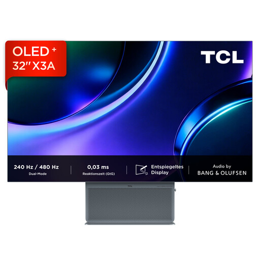
TCL 32x3A 32-inch OLED monitor
The 32-inch screen is an option if you want to arrange code, your browser and other work windows across a larger area.
Listed in the product title: OLED, 4K UHD and 3840 × 2160 pixels.
View at Joybuy
 No image available
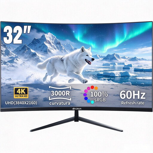
CRUA CR320QB curved 32-inch 4K monitor
The 32-inch screen gives you a larger physical workspace if you want to use programme overviews and layout tools side by side.
Listed in the product title: curved VA display, 3000R, 4K UHD with 3840 × 2160 pixels and 100% sRGB.
View at Joybuy
 No image available
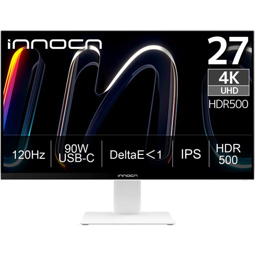
INNOCN CB27U1 27-inch 4K UHD monitor
The 27-inch size and 4K resolution suit a workspace where you edit page layouts and content on a desktop monitor.
Listed in the product title: IPS display, 3840 × 2160 pixels, 120 Hz and USB-C with 90 W Power Delivery. Check your laptop’s video output and charging requirements.
View at Joybuy
 No image available
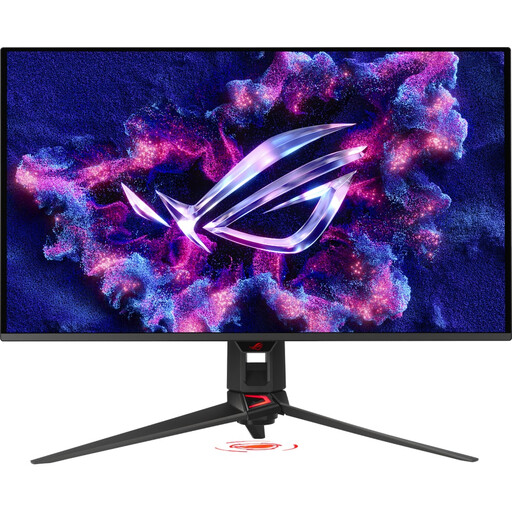
ASUS ROG Swift OLED PG32UCDMR 32-inch 4K UHD monitor
The 32-inch screen is designed for a permanent workstation where you want to arrange several windows side by side.
Listed in the product title: 3840 × 2160 pixels, 240 Hz and USB-C with 90 W. Check that the connection is compatible with your laptop.
View at Joybuy
 No image available
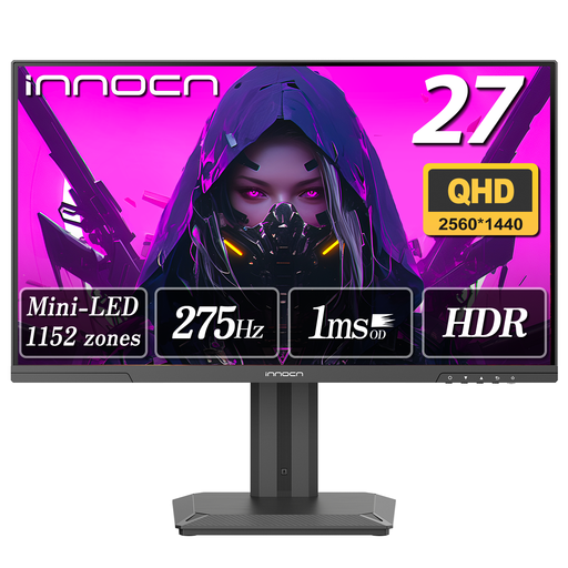
INNOCN 2751S PLUS 27-inch Mini LED monitor
This QHD option is worth considering for a 27-inch workspace if you don’t specifically need a 4K model.
Listed in the product title: IPS display, QHD 2K, 275 Hz, 1 ms, 99% sRGB and 99% Adobe RGB.
View at Joybuy
Frequently asked questions
Can I check mobile layouts using only a large monitor?
No. In Chrome DevTools, you can simulate viewports and change their width; Google notes that device mode doesn’t run on an actual mobile device. So make sure you also check important pages and ticket journeys on a mobile device.
Is a USB-C connection enough to connect and charge my laptop?
Not without checking that it’s compatible with your laptop and monitor. BenQ lists USB-C with DisplayPort Alt Mode and 65 W Power Delivery for the PD2705U; ASUS lists 96 W USB-C Power Delivery for the PA279CRV. Check whether your laptop can output video through the relevant connection and how much charging power it needs.
What should I consider when festival websites are heavily zoomed in?
The W3C explanation of the Reflow criterion refers to a width of 320 CSS pixels for vertically scrolling content. In general, information and functionality should remain available without scrolling in two directions; exceptions apply to certain two-dimensional content. This relates to the website, not a guaranteed monitor feature.
How do I find the right colour mode for posters and trailers?
First decide on your intended output, then check which modes the specific model lists for it. sRGB, Rec.709, P3 and Adobe RGB specifications aren’t interchangeable; the right choice depends on your graphics or video workflow.
What are my rights when buying a monitor online?
For a standard online purchase from a trader, you generally have a 14-day right to cancel from the date of delivery. The European Union explains that faulty goods are covered by a minimum two-year legal guarantee. The right to cancel doesn’t apply in the same way to purchases from private individuals; a voluntary manufacturer’s warranty is separate from your statutory rights.


