Writer of a text-heavy magazine
If you write instructions and captions while checking page layouts and reference images, clear text, room for your work windows and an adjustable screen are all important.


If you mainly write and check images alongside your page layout, start by looking for plenty of screen space, clear text and a stand that can be adjusted to suit you. If you need to assess colours for a planned print run, the specific colour-management workflow, a suitable profile and print preview are also important. A wide colour gamut alone does not guarantee a match with the printed result.
If you write instructions and captions while checking page layouts and reference images, clear text, room for your work windows and an adjustable screen are all important.
If you mainly edit bike maintenance images for viewing on screen, you should be able to control your colour workflow and make sure it works with the profiles you use.
If you’re preparing the magazine for a specific print process, you’ll need suitable profiles and a print preview to assess colours under the intended output conditions.
A good fit if: Writing, captions and page layouts make up most of your work.
Trade-off: You may not need extra features for advanced colour correction. Check text size and the video signal with your computer.
A good fit if: You mainly assess reference images for viewing on screen and can use consistent profiles.
Trade-off: Wide Adobe RGB coverage is not the only factor that matters; the colour workflow across the entire production chain is important.
A good fit if: You need to assess colours for a specific print run and know which output profile to use.
Trade-off: Monitor features can’t replace the print process profile or coordination with the print production team.
For this magazine, your main reason for buying matters most: text and layout, assessing digital images, checking print colours or finding a monitor that fits your existing workspace. The figures refer to consumers choosing a monitor for this magazine; each person is assigned to their top priority.
| Priority | What to check before buying | Who considers this important? |
|---|---|---|
| Readability and workspace | Consider screen size and resolution together; test your document and image preview at the scaling you want to use. | When I’m working on long instructions and captions alongside image crops, I want to be able to read everything comfortably. Around 36 % of consumers prioritise text and layout. |
| Digital image colours | Check the colour mode and profiling options; don’t confuse the manufacturer’s stated coverage with your own measurement. | When I’m assessing reference images for screen output, I want to edit colours using a workflow I can control. Around 29 % of consumers prioritise assessing digital images. |
| Colours for print | Check the print requirements and the right output profile; make sure the specific model’s calibration features suit the workflow you plan to use. | When I’m preparing the magazine for a specific print process, I want to assess images using the right profiles. Around 21 % of consumers prioritise checking print colours. |
| Connections and setup | Check the video output, cables and charging requirements of your computer; make sure the monitor is adjustable and fits your desk. | When I need a screen to work with my existing computer and desk, the right connections and a suitable setup are essential. Around 14 % of consumers have this as their top priority. |
Adobe recommends checking the print production requirements before preparing files for print. Soft proofing requires a suitable print profile; a monitor’s colour gamut coverage alone does not prove that it will match the final print.
The on-screen preview also depends on the profile and conditions of the intended print process.
Check the print requirements first, then decide whether your magazine needs any additional monitor features.
Profiling, coordinating with the print production team and ordering proofs can all add to the workload.
Whether a monitor works with your laptop depends on whether the laptop’s port supports the required video output and provides suitable power.
Compare the connection specifications of both devices before you buy.
Depending on the combination of devices, you may need a compatible cable or a separate power supply.
As a rule, statutory rights in the event of a fault are claims against the seller; a voluntary guarantee has its own terms and conditions.
Keep your proof of purchase and the guarantee terms, and contact the relevant seller first if there’s a fault. The Verbraucherzentrale explains the difference between statutory rights and a guarantee.
The ProArt PA279CRV is one example of a 27-inch 4K monitor with selectable colour modes for image and layout work.
The DesignVue PD2705U is an example of a monitor designed for a screen-based colour workflow, with a 27-inch 4K display.
The ColorEdge CS2740 is one example of a monitor with features for colour-managed image and print work.
The Pro P2725QE is an example of a 27-inch 4K work monitor with an adjustable stand.
According to the manufacturer, the UltraFine 27UP850K-W combines a 27-inch 4K IPS display, USB-C and an adjustable stand.
The models below are worth considering if you combine text and layout work with reference images. Their product specifications alone don’t make any of them a reliable print proofing monitor.
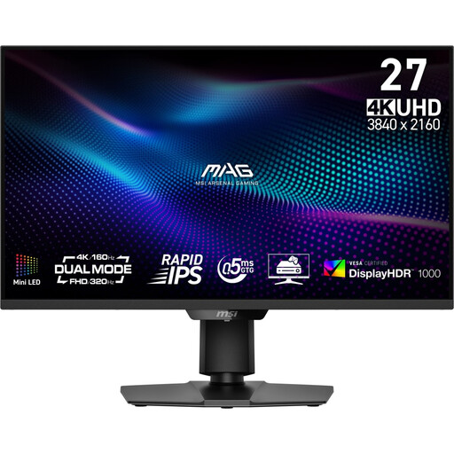 No image available
Could be suitable for working with text and reference images; consider your entire colour workflow when assessing colours.
27 inches; UHD 160 Hz or FHD 320 Hz; Mini-LED; Rapid IPS.
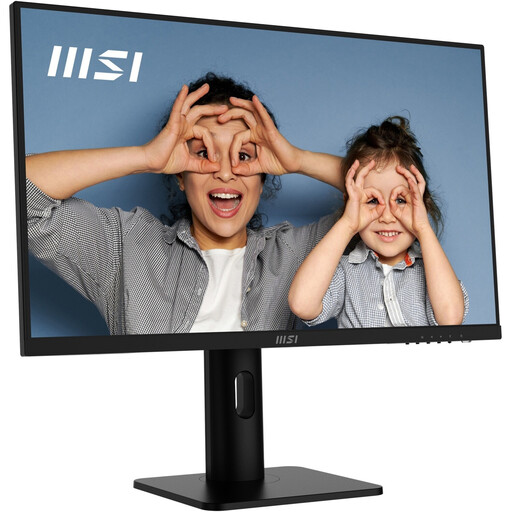 No image available
Could suit text and layout work with accompanying images; check your preferred text size and scaling with your own computer.
27 inches; 4K UHD; IPS; 60 Hz; HDR Ready.
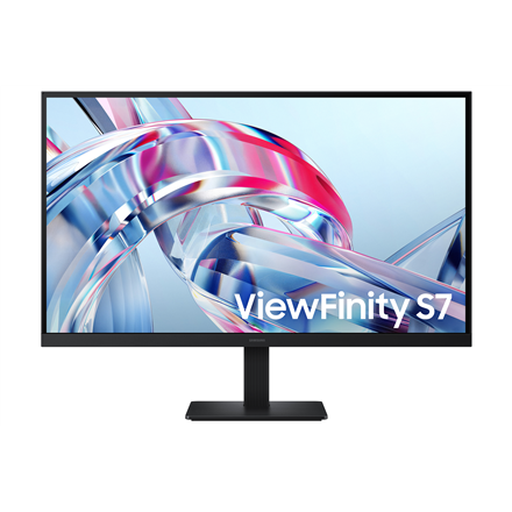 No image available
Could be worth considering for viewing text and reference images side by side; for print colours, you’ll also need a suitable profile and proofing workflow.
27 inches; 4K UHD; IPS.
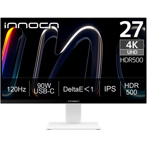 No image available
Could suit text and image work on a shared screen; check that the connections are compatible with your computer.
27 inches; 4K UHD; 3840 × 2160; IPS; 120 Hz; HDR500.
 No image available
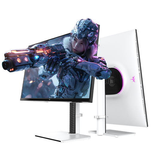
Could be suitable for layout work with multiple windows and reference images; check that the connections work with your computer.
27 inches; 4K 160 Hz or FHD 320 Hz; Mini-LED; Fast IPS.
No, not just because you’re working with reference images. What matters is whether you’re mainly assessing colours for screen viewing or preparing images for a specific print process. For print, your workflow should include a suitable output profile and print preview; the monitor’s colour gamut coverage is only one part of the picture.
Check the font size and scaling using the document you’ll actually work on, avoid distracting reflections and adjust the monitor to suit your setup. The BAuA rule ASR A6 covers display screen equipment at workplaces and in home-based teleworking within its scope; it is not a blanket requirement for every home desk.
Monitors and print have different output conditions. For a planned print run, Adobe recommends checking the print production requirements and assessing a preview with a suitable print profile. Calibrating your screen alone won’t determine the paper or printing inks.
When comparing power consumption, look at the figures on the EU energy label rather than just the efficiency class. If there’s a fault, distinguish your statutory rights against the seller from any voluntary guarantee; the Verbraucherzentrale says that for a typical consumer purchase, statutory rights generally last for two years from delivery.
Electronic displays such as computer monitors are generally covered by EU energy labelling rules. The European Commission lists exceptions for certain types of display; the label provides information for the market and consumers and is not an approval that buyers need to obtain afterwards.