Editors working with multiple windows
You write articles about gardening and want to view sources or a website preview alongside your editor. What matters is having enough usable screen space and readable text at your chosen scaling.


Choose a monitor based on whether you want to use your editor, website preview and other windows at the same time, and whether text remains easy to read at your preferred scaling. A compact screen may be enough for individual work windows; a higher resolution or larger screen can make it easier to view several things side by side, but will take up more space. Keyboard accessibility must be checked directly on the website, regardless: a monitor cannot make up for a lack of support in the website’s code.
You write articles about gardening and want to view sources or a website preview alongside your editor. What matters is having enough usable screen space and readable text at your chosen scaling.
You spend time checking navigation, forms and visible keyboard focus. The monitor’s position and readability can make this easier, but they don’t replace testing the website with a keyboard.
You assess plant photos and page details, weighing up a larger or higher-resolution display against desk space, scaling and connection requirements.
First, decide whether limited desk space, several windows visible at once or the ability to assess image details matters most for your work.
A good fit if: You have limited space and usually work on one document or preview at a time. EIZO lists the FlexScan EV2490 as having a 23.8-inch screen and a resolution of 1920 × 1080 pixels.
Trade-off: Compared with the QHD and 4K resolutions mentioned here, there are fewer pixels available for working with multiple windows side by side. Scaling and window sizes also affect usability.
A good fit if: You regularly want your editor and preview side by side. Dell lists the P2425DE as having a 23.8-inch screen and a resolution of 2560 × 1440 pixels; Lenovo lists the ThinkVision T27h-30 as a 27-inch QHD monitor.
Trade-off: Consider screen size, readability at your chosen scaling and the space available. USB-C docking varies by model and must be compatible with your laptop.
A good fit if: You want to assess garden photos, fine layout details or several work areas on a larger screen. ASUS lists the PA279CRV as having a 27-inch screen and a resolution of 3840 × 2160 pixels; BenQ lists the RD320UA as having a 31.5-inch screen and the same resolution.
Trade-off: A higher resolution doesn’t guarantee comfortably sized text or show exactly how a finished image will look on other devices. Check the available space, scaling and connections.
| Buying priority | What to check before buying | Who is it most relevant to? |
|---|---|---|
| Space for an editor and preview | Compare your window layout, screen size, native resolution and readability at your chosen scaling. | If I use an editor and preview at the same time, I want both to be easy to read at my chosen scaling. Around 33% of consumers say space for multiple windows is their top priority. |
| Readable text and visible keyboard focus | Check text size and scaling on your own computer; test links, menus and forms without using a mouse. | When testing keyboard access, I want to be able to see the text and visible focus clearly, even during longer checks. Readability and checking focus are top priorities for around 27% of consumers. |
| An adjustable working position | Check the height, tilt and, where available, pivot adjustment, as well as desk depth and lighting conditions. | If I work at a screen for long periods, I want to adjust its height and orientation to suit my workspace. An adjustable screen position is the top priority for around 20% of consumers. |
| Connecting to a work laptop | Check the laptop’s video output, charging requirements and the peripheral connections you need against the specifications of the exact monitor model. | If I use the monitor with my laptop, I want to know whether the connections I need are compatible with my device. Connecting to a laptop is the main priority for around 13% of consumers. |
| Garden images and layout details | Check the native resolution and documented colour modes of the specific model; also assess images on the devices they’re intended for. | When looking at plant photos and fine page details, I want to assess the detail without assuming that resolution alone determines how the finished image will look. Image detail is the top priority for around 7% of consumers. |
Whether menus, links and forms can be used with a keyboard depends on how the website is built. The W3C Web Accessibility Initiative describes native HTML controls such as links and buttons as being keyboard-accessible by default.
Choose a monitor for its workspace and readability, then test the website separately with a keyboard.
Screen size, resolution and scaling affect different aspects of how you work. More pixels alone don’t tell you whether text and window layouts will feel comfortable in your workspace.
Check how you typically arrange your editor, preview and tools at a scaling that’s easy for you to read.
A USB-C port alone doesn’t guarantee that your laptop can receive video, data and enough power to charge through it. If the ports or requirements don’t match, you may also need a dock or a separate power supply.
Check your laptop’s video output, charging requirements and peripheral connections against the specifications for the exact monitor model.
The Pro P2425DE is a compact QHD work monitor with a USB-C hub and height adjustment.
According to Lenovo, the ThinkVision T27h-30 combines a 27-inch QHD workspace with USB-C docking and an adjustable stand.
According to ASUS, the ProArt PA279CRV is a 27-inch 4K option for working with fine image and layout details.
According to BenQ, the RD320UA is a 31.5-inch 4K monitor that offers a large viewing area for work.
The FlexScan EV2490 is a smaller office monitor that may suit you if you mainly work in one area or have limited space.
This selection includes QHD and 4K monitors for working with multiple windows and larger viewing areas.
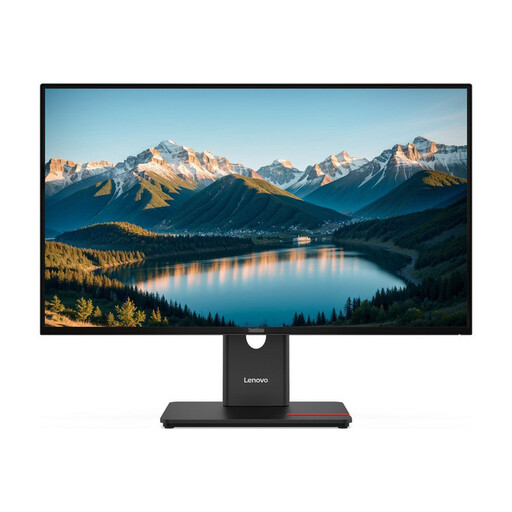 No image available
The 27-inch QHD specification may suit you if you want to arrange your editor and website preview across a larger workspace.
27 inches; QHD; IPS; black.
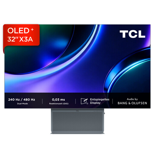 No image available
The 32-inch 4K version listed in the product title may suit you if you’re looking for a large viewing area for windows and layout details.
32 inches; 4K UHD; 3840 × 2160; OLED.
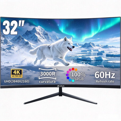 No image available
The stated 32-inch screen size and 4K resolution are worth considering if you want to view multiple windows or layout details on a larger screen.
32 inches; curved; 3840 × 2160; VA; HDR10.
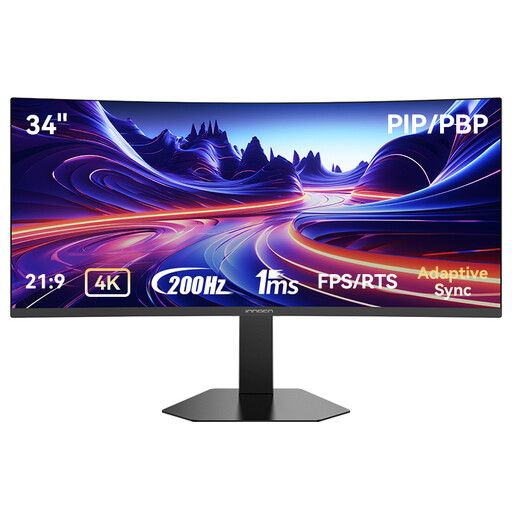 No image available
The wide UWQHD format is an option if you want to arrange your editor and preview side by side.
34 inches; 3440 × 1440 pixels; VA; 21:9; 200 Hz.
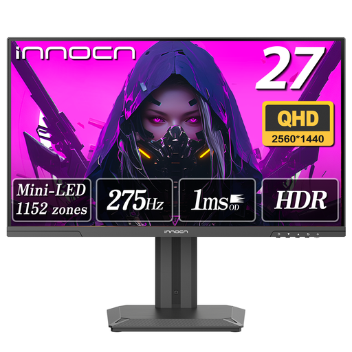 No image available
The 27-inch QHD specification may suit a workspace where you want your editor and preview side by side.
27 inches; QHD; Mini LED; 275 Hz.
No. Test links, buttons, menus and forms using a keyboard, and check the focus order and visible focus. A monitor can help you inspect the website, but it can’t make up for a lack of keyboard accessibility in the website’s code.
Position an adjustable monitor to suit your working posture and take distracting reflections into account. Follow the instructions for your specific monitor model when cleaning it and choosing cleaning products.
Not simply because the website is about gardening or can be accessed in a browser. The German Federal Government Commissioner for Matters relating to Persons with Disabilities describes services in electronic commerce as including, in particular, services offered through a website or app in response to an individual request from a consumer in relation to a consumer contract. Whether this or another covered service applies depends on the actual service and the operator.
The European Commission generally includes computer monitors among electronic displays that require an energy label, although some types of display are exempt. Check the energy label and consumption information for the specific model rather than assuming its energy use based on resolution alone.