Comparing colours for web and social media
If you’re placing different edits side by side, a reliable sRGB workflow and a well-maintained monitor profile matter more than colours that simply look vivid.


When choosing an ultrawide monitor for comparing colours, start with the colour gamut your output requires and a reliable colour workflow – extra width alone won’t guarantee consistent colours. A 34-inch model may be enough for sRGB work and a compact desk; depending on how you work, more screen height, uniformity features or notebook docking may matter more. Before buying, check the specifications for the exact model, along with your computer’s video output and charging requirements.
If you’re placing different edits side by side, a reliable sRGB workflow and a well-maintained monitor profile matter more than colours that simply look vivid.
If you want to keep image variations, references and tools visible at the same time, usable width matters, along with extra screen height if it suits the way you work.
If you switch between a notebook and a larger screen, the video connection, charging power and adjustability should suit your devices and workspace.
Start with the colour gamut your output requires and your colour workflow. Then consider whether screen height, desk space or notebook connectivity is the biggest factor for your workspace.
| What to consider | What to look for | Who should prioritise it? |
|---|---|---|
| Comparing colours | Check that the colour gamut suits your output, and look for colour modes, a factory calibration report and profiling options. If needed, check whether the specific model has a uniformity feature. | If I want to judge colour differences between edits, I need a suitable colour gamut for my output and a well-maintained profile. Around 33% of consumers put colour comparison first. |
| Workspace and screen height | Compare the native resolution and the dimensions of the screen and stand with your desk and the space available in depth. | If I want to view edits and tools side by side, usable width and screen height are important. Around 27% of consumers prioritise workspace for this reason. |
| Connecting a notebook | Check the video output, supported resolution, charging power required and cables against the connections on both devices. | If I want to use my notebook without constantly switching cables, the video signal and power supply need to be compatible. Around 20% of consumers prioritise notebook connectivity. |
| Set-up and running costs | Check whether the calibration equipment you need is included, and compare the energy labels for the specific models. | If I want to keep extra set-up work and running costs down, I check the accessories and energy label first. Around 20% of consumers prioritise these costs and considerations. |
Colour gamut coverage alone doesn’t tell you how accurately a set-up monitor reproduces colour. Adobe recommends calibrating and profiling your monitor.
Compare edits using the appropriate colour mode and a well-maintained monitor profile.
Keeping your profile up to date takes time; depending on the calibration method you choose, you may also need a measuring device.
Ultrawide models vary in resolution, connection type and stated charging power. The connection needs to work with both your computer and the signal you want to use.
Check the resolution, video output and charging requirements against your computer, notebook and cable.
Depending on the connections available, you may need compatible cables or adapters.
Print comparisons also depend on the output profile and its simulation; a P3 figure on its own doesn’t demonstrate Adobe RGB suitability.
First decide what you’re producing, then check which colour gamut and soft-proofing workflow you need.
A 34.1-inch option for sRGB and Rec.709 work, with notebook docking.
A 34-inch model with sRGB and P3 modes for creative workflows.
A 39.7-inch option with 5K2K resolution for more screen space.
A 34-inch model for office work and notebook connectivity, with a Thunderbolt hub.
The ultrawide models below offer different amounts of workspace and features for comparing colours. Check the colour gamut specifications, resolution and connections for each individual model.
 No image available
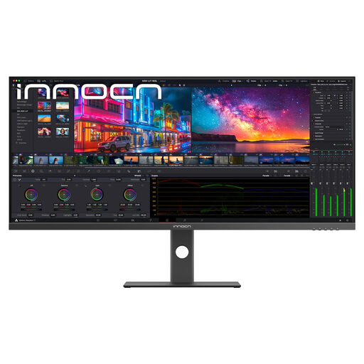
An option if you want to view image variations and tools at the same time, with extra screen height. The stated colour specifications don’t replace checking how it performs in your own set-up.
The product specifications list a resolution of 5120 × 2160 pixels, 100 Hz, 99% sRGB, PIP/PBP and USB-C with 65 W Power Delivery. A Color Calibration Report is listed as included.
 No image available
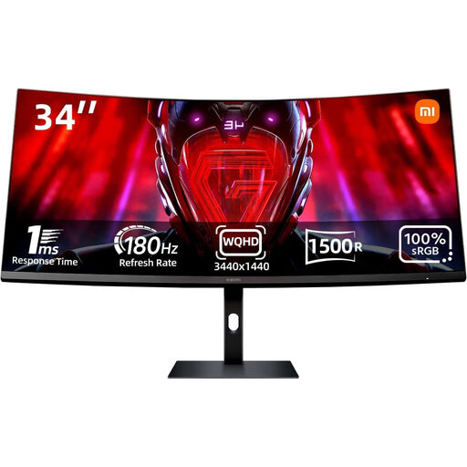
Could suit a wide workspace geared towards sRGB. Check colour reproduction as part of your own workflow rather than assuming that coverage alone guarantees consistent colours.
The product specifications list a resolution of 3440 × 1440 pixels, 21:9, 100% sRGB and 180 Hz. They also mention tilt adjustment, DisplayPort and HDMI connections.
 No image available
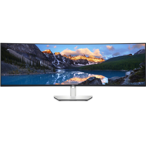
The wide screen may suit you if you want to arrange two views side by side; a DCI-P3 figure alone doesn’t determine whether it’s right for your workflow.
The product specifications list a resolution of 5120 × 1440 pixels, 32:9, 60 Hz and 98% DCI-P3. They also specify factory calibration to Delta E < 2 and USB-C with 90 W Power Delivery.
 No image available
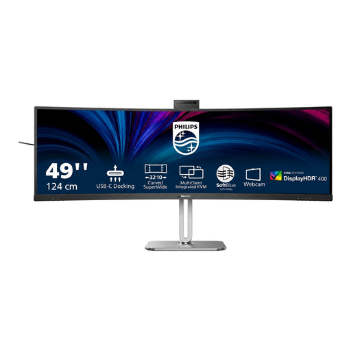
A wide workspace can make it easier to compare variations side by side; check the colour gamut specifications against the output you’re working towards.
The product specifications list a resolution of 5120 × 1440 pixels, 32:9 and 75 Hz. They also include USB-C with 100 W Power Delivery, plus height, tilt and swivel adjustment.
 No image available
Could be worth considering for sRGB-oriented comparisons across a wide workspace; check that the stated charging power meets your notebook’s requirements.
The product specifications list a resolution of 3440 × 1440 pixels, 21:9 and 99% sRGB. They also include USB-C with up to 100 W Power Delivery, plus height, tilt and swivel adjustment.
Use a colour mode suited to your output and keep your monitor profile up to date. Adobe recommends recalibrating regularly for Photoshop. Also position your screen to avoid glare from windows; the German Social Accident Insurance guidance on screen positioning is a practical reference, not a blanket requirement for every home office.
No, a P3 figure alone doesn’t demonstrate suitability for a particular print workflow. The output profile and soft proof are relevant to your comparison; Adobe describes soft proofing with colour profiles. Check the print colour gamut you need separately.
Check whether your calibration method requires a measuring device and whether one is included. LG notes that the hardware calibrator isn’t included with the 40WP95XP-W. You can also compare the energy labels for the monitors you’re considering to assess power consumption.
If a monitor bought by a consumer is faulty, statutory consumer rights against the seller are separate from any voluntary manufacturer’s warranty. The German consumer advice centre generally states that the statutory guarantee period is two years. For sales contracts from 31 July 2026 onwards, it also explains a one-off 12-month extension if you choose repair rather than replacement when a fault arises.
Take it to a separate collection point for waste electrical equipment rather than putting it in household rubbish. The German Environment Agency explains return options for large old appliances, including when buying a new appliance of the same type online; check the specific arrangements with your retailer.